Appendices Guide
PST 315: Methods of Policy Analysis and Presentation
Your Appendices section will contain Appendix I, II, III, and depending on your project, Appendix IV and V. If you do not have disaggregated graphs or open-ended responses, take out Appendix IV or V from the Table of Contents as necessary.
Appendices are very customized to each individual project. Be sure to discuss with your UCA what your appendices might look like specific to your project.
The examples below use sample data. Skills Win Coaching Organization is a real Syracuse University program, but the survey, responses, and numbers shown here are invented for teaching purposes and are not actual SWCO results.
Appendix I – Research Questions
Appendix I shows the questions you are aiming to answer through your project. If you conducted a survey, this section will contain screenshots of your survey. If your project is related to data collection or analysis, you will paste your research questions into this section.
If your project is a survey, take a screenshot of your survey (whether it’s a paper survey or digital survey) and insert your screenshot(s) into Appendix I. Make sure your screenshot includes all questions asked in your survey.
If your project is not a survey, directly paste your research questions into Appendix I, like this:
- How helpful did students find the site session coaches?
- How engaging did students find the site session exercises?
- Did student views on the exercises differ by site?
- What do students feel could be improved about the site sessions?
- How many sessions did students attend over the semester?
- Would students recommend the site sessions to a friend?
- Which session topics did students find most useful?
Appendix II – Data Frequencies
Appendix II shows the number (or percentage) of times a specific response or category appears within your dataset. In effect, it is a list of frequency tables for each variable analyzed in your report.
Data frequencies for a survey question:
The coaches were helpful.
| Response | Number | Percentage |
|---|---|---|
| Strongly agree | 89 | 42% |
| Agree | 63 | 29% |
| Neutral | 44 | 21% |
| Disagree | 12 | 6% |
| Strongly disagree | 5 | 2% |
| No response | 1 | <1% |
Data frequencies for a data-collection project might look like:
Sessions delivered by site, Fall 2026
| Category | Number | Percentage |
|---|---|---|
| Site A | 14 | 39% |
| Site B | 12 | 33% |
| Site C | 10 | 28% |
Appendix III – Codebook and Spreadsheet
Appendix III is your Codebook and Spreadsheet. Your spreadsheet must contain your coded data (not the raw data). If your spreadsheet contains open-ended responses, leave the open-ended responses as is. See the Codebook and Spreadsheet Guide for how to build both.
| Column | Field Name | Definition | Code |
|---|---|---|---|
| A | ID | Respondent’s unique identification number | Code is identical to identification number |
| B | SITE | Which site session did you attend? | 1 = Site A … |
| C | GRADE | What grade are you in? | 1 = 9th … |
| D | COACH | The coaches were helpful. | 1 = Strongly disagree … |
| E | ENGAGE | The exercises were engaging. | 1 = Strongly disagree … |
| F | IMPROVE | What could be improved at your site sessions? | Open ended response: … |
| ID | SITE | GRADE | COACH | ENGAGE | IMPROVE |
|---|---|---|---|---|---|
| 1 | 1 | 3 | 5 | 4 | 1 |
| 2 | 2 | 4 | 4 | 5 | 2 |
| 3 | 1 | 2 | 3 | 3 | 1 |
| 4 | 3 | 4 | 5 | 2 | 3 |
Appendix IV – Open-Ended Responses
You will only have Appendix IV if you have open-ended questions in your survey. In this section, you will copy open-ended responses and paste them into the section. Do not correct any spelling or grammatical errors – the responses should be copied as they were originally written. See the Qualitative Coding Guide.
What could be improved at your site sessions?
More activities (n=8)
- More hands on activities would be good.
- add more group activities
- More activities like the resume one.
- i liked the practice interviews, do more of those
More time (n=6)
- The sessions felt rushed at the end.
- more time for each activity
- Longer sessions.
- We needed more time to finish.
Smaller groups (n=4)
- The groups were too big.
- smaller groups so everyone can talk
- Too many people at my table.
- Smaller groups would help.
Better materials (n=3)
- The handouts were hard to read.
- better worksheets
- The packet had typos in it.
Nothing (n=2)
- Nothing, it was great.
- nothing
Appendix V – Disaggregated Graphs
You will only have Appendix V if your responses require disaggregated graphs.
Disaggregated graphs are used when you need to display how different subgroups within a population perform or behave. For example, disaggregating test scores by gender, age, or ethnicity to reveal patterns that may not be apparent when the data is aggregated.
Paste your disaggregated graphs into Appendix V with a source below each graph.
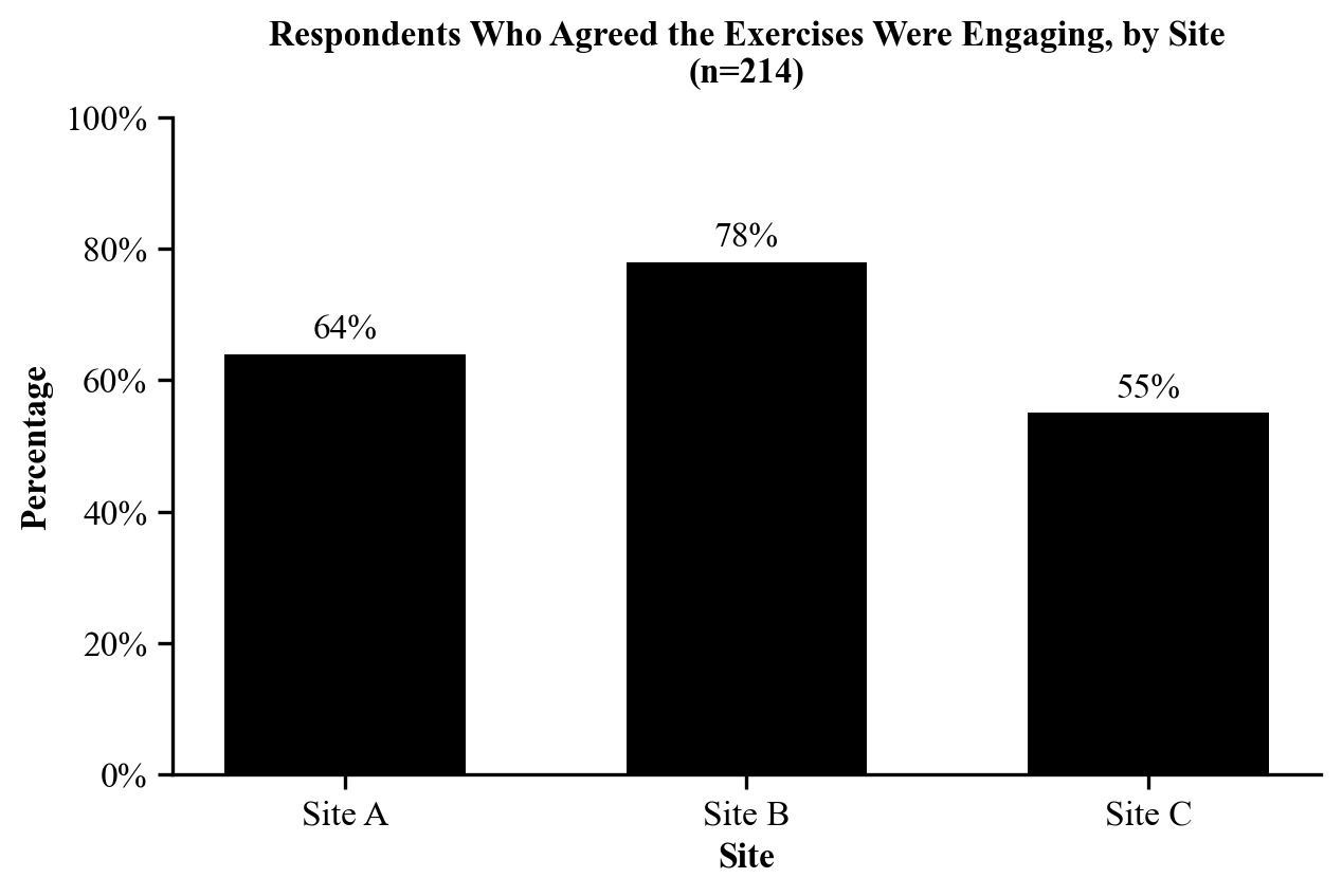
Source: Sample data collected and analyzed by Jordan Alvarez for the Skills Win Coaching Organization, Community Link Project, November 2026.