Graphing Guidelines
PST 315: Methods of Policy Analysis and Presentation
Every graph in your report must follow these guidelines.
Graph type
- Default to a bar graph. Do not use another type of graph (for example, a pie chart) without talking to your UCA or Professor.
- If there are 5 or fewer bars, arrange the bars vertically.
- If there are 6 or more bars, arrange the bars horizontally.
Color
- Everything is black – no gray!
- Be careful: Excel will sometimes default to a very dark gray.
- Bars are solid black.
- Axis lines are solid black.
- No borders on bars, and no extra shading on bars.
- No border on your graph.
Text
- ALL text is Times New Roman 12pt.
- Double check your title is 12pt! When you update everything to TNR 12pt, sometimes the title will default back to a larger font. You may have to adjust the font size of your title a second time.
- Axis titles should be bold.
- The title should be bold.
- “n=sample size” should be under your title.
Axes and data labels
- The y-axis starts at 0.
- Use outside-end data labels. You will know this is done correctly if percentages display above your bars.
- Use major outside tick marks on your axis.
Important
Copy and paste your graph into the report. No screenshots!
Example of a graph that follows the guidelines
NoteAbout this example
This example uses sample data. Skills Win Coaching Organization is a real Syracuse University program, but the numbers shown are invented for teaching purposes and are not actual SWCO results.
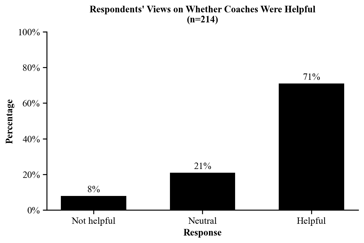
Check it against the list above: bar graph, three bars so arranged vertically, solid black bars and axis lines, Times New Roman 12pt throughout, bold title and bold axis titles, y-axis starting at 0, outside-end data labels showing percentages, “n=” under the title, major outside tick marks, and no border.